In the world of advertising, logo design and branding is one of the key pillars of a company’s identity. The amount of thought and work that goes behind the seemingly simplest of logos would boggle the mind of any advertising outsider.
Here are 23 clever logo designs that have hidden symbolism you may have not noticed before. Some are obvious, others are subtle, but all of them are interesting to examine. Enjoy!
Fedex
The white space between the E and the X forms a perfect arrow, suggesting a company moving forward and looking ahead. Considered a classic, now it’s all I see whenever the logo appears.
Cisco
The vertical lines are meant to represent both San Francisco’s Golden Gate Bridge as well as a digital signal. In fact, the name Cisco is itself derived from “San Francisco”.
Facebook Places
If you didn’t already know Facebook Places, is Facebook’s geolocational product, which is in direct competition with the current leader in that area Foursquare. Now if you take another look at Facebook Places logo you will notice it is a 4 in a square now is this a coincidence or a dig at Foursquare?
Toblerone
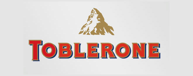
Based out of Bern, Switzerland, it just so happens that this chocolate company is headquartered in the city of bears. You may not have noticed that the logo features a bear climbing a mountain.
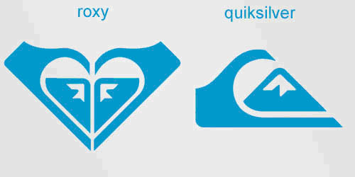
Roxy
Roxy is a clothing line for girls who love surfing and snowboarding. It is owned by Quiksilver and the logo consists of two Quiksilver logos rotated to form a heart. Awwww.
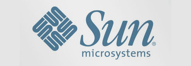
Sun Microsystems
This logo was designed by professor Vaughan Pratt of the Stanford University. Having a clever ambigram you can read the brand name in every direction; horizontally and vertically.
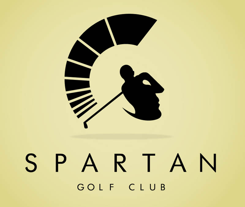
Spartan Golf Club
Looking head on, it appears to be a golfer who has just completed a drive, no doubt in the middle of the fairway! However, when you look at a side profile, the helmet of a Spartan warrior appears. Nice dual symbolism works well for this logo.
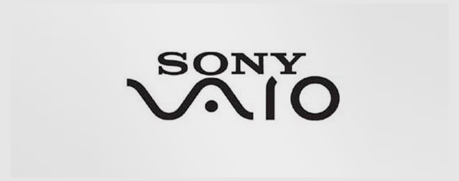
Sony Vaio
The Sony Vaio logo symbolizes the integration of analog and digital technology. The “VA” forms an analog wave and “IO” represents a binary 1 and 0.
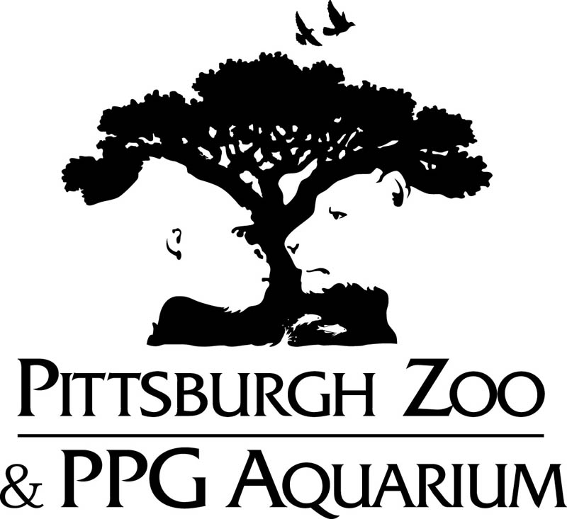
Pittsburgh Zoo & PPG Aquarium
On either side of the tree, the faces of a gorilla and lion appear in white. In many of these examples of hidden symbolism, the ‘secondary’ imagery is often found by looking at the ‘negative space’ of the logo.
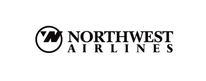
Northwest Airlines
The old Northwest Airlines logo may look like a simple logo but if you take a closer look the symbol on the left actually represent both N and W and because it is enclosed within the circle it also represents a compass pointing northwest.
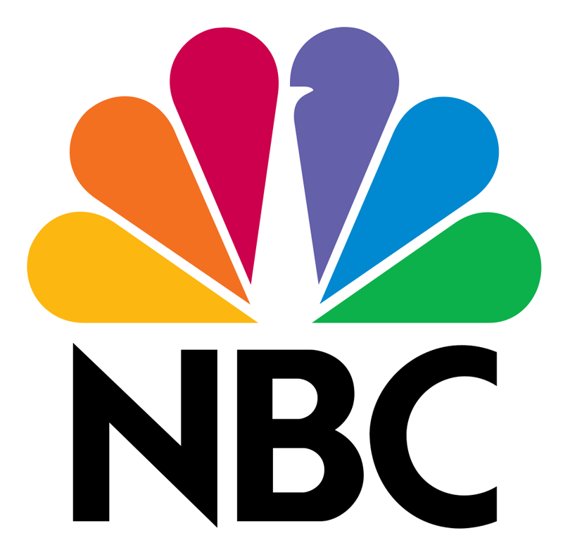
NBC
The iconic NBC logo has a peacock in white with five colorful feathers representing each division of NBC (when the logo was originally designed, as there are more now). The peacock is also looking to the right, often associated with looking ahead or forward.
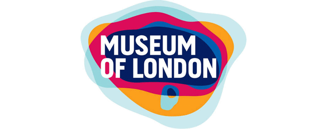
Museum of London
The Museum of London logo may look like a modern logo design but it actually represents the geographic area of London as it as grew over time.
Milwaukee Brewers
The old Milwaukee Brewers logo may look like a simple catchers mitt holding a ball, but if you take a second you will see the team’s initials M and B.
London Symphony Orchestra
Do you see the “LSO” letters or an orchestra conductor?
Hershey’s Kisses
The tasty Hershey’s Kisses logo is similar to the FedEx logo in that there is a hidden Hershey’s kiss between the ‘K’ and the ‘I’. You might need to tilt your head slightly to the left to really see it :)
Goodwill
The iconic smiling face is in fact the ‘G’ in Goodwill zoomed in an cropped slightly. Clever :)
Bronx Zoo
Another ‘negative space’ gem is the Bronx Zoo logo, where New York’s iconic skyline of tall buildings can be found between the legs of the giraffes.
Baskin Robbins
The BR in the Baskin Robbins logo is made of two colours. When you focus on just the pink portion, the number 31 appears, denoting the number of flavours Baskin Robbins offers!
Atlanta Falcons
The logo for the NFL football team the Atlanta Falcons has an easily visible graphic of a falcon, but did you notice the shape of the bird also forms the letter ‘F’?
Amazon
Did you ever notice the arrow from ‘A’ to ‘Z’ in the Amazon logo? The thought is that Amazon carries everything from A to Z. Some say it also forms a slight smiley face…
VIA Rail Canada
The iconic Canadian railway company VIA has a fascinating logo. If you focus on the white space between the ‘V’ and ‘I’ and then again at the white space between the ‘I’ and the ‘A’ you’ll notice two parallel lines representing railway tracks. It’s subtle but effective.
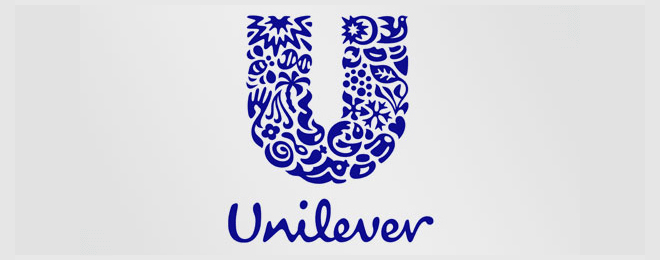
Unilever
Unilever is one of the biggest producers of food, beverages, cleaning agents and personal care products. They produce a huge amount of different products and they wanted to reflect this in their logo. Each part of the logo has a meaning. You can see bees, birds, dna, corn, flower, palm tree, and much more inside the “U”.
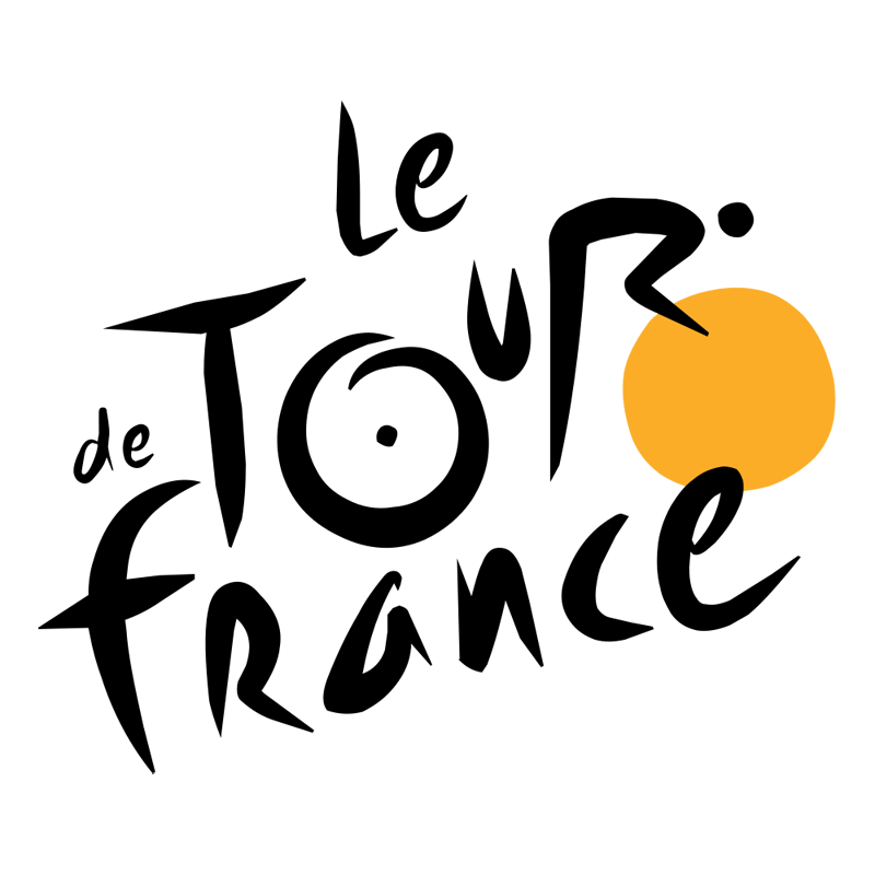
Tour de France
The Tour de France logo actually contains the image of a cyclist which can be seen in the letter ‘R’, with the orange circle symbolizing the front tire.
Share this story with your friends and see if they can spot the hidden messages in these logos!
