Movie posters are an incredibly important part of a film’s marketing strategy. They are created to promote films and to intrigue audiences. In the days before Photoshop, movie posters were often as much a piece of art as the movie itself. When we think of Jaws, Stanley Kubrick’s Clockwork Orange, or Scarface, the first thing that comes to mind may not be a scene from the film, but the image of the promotional poster that advertised it.
These days, movie studios seem to have run out of original ideas. The sheer ubiquity of the clichés in current film advertising makes it more than a little difficult to differentiate between one film and another. Most studios rely on the same, tired concepts to tease their films. As a case in point, try recalling what the posters for this year’s blockbusters look like. Chances are you’ll find it hard to recall any.
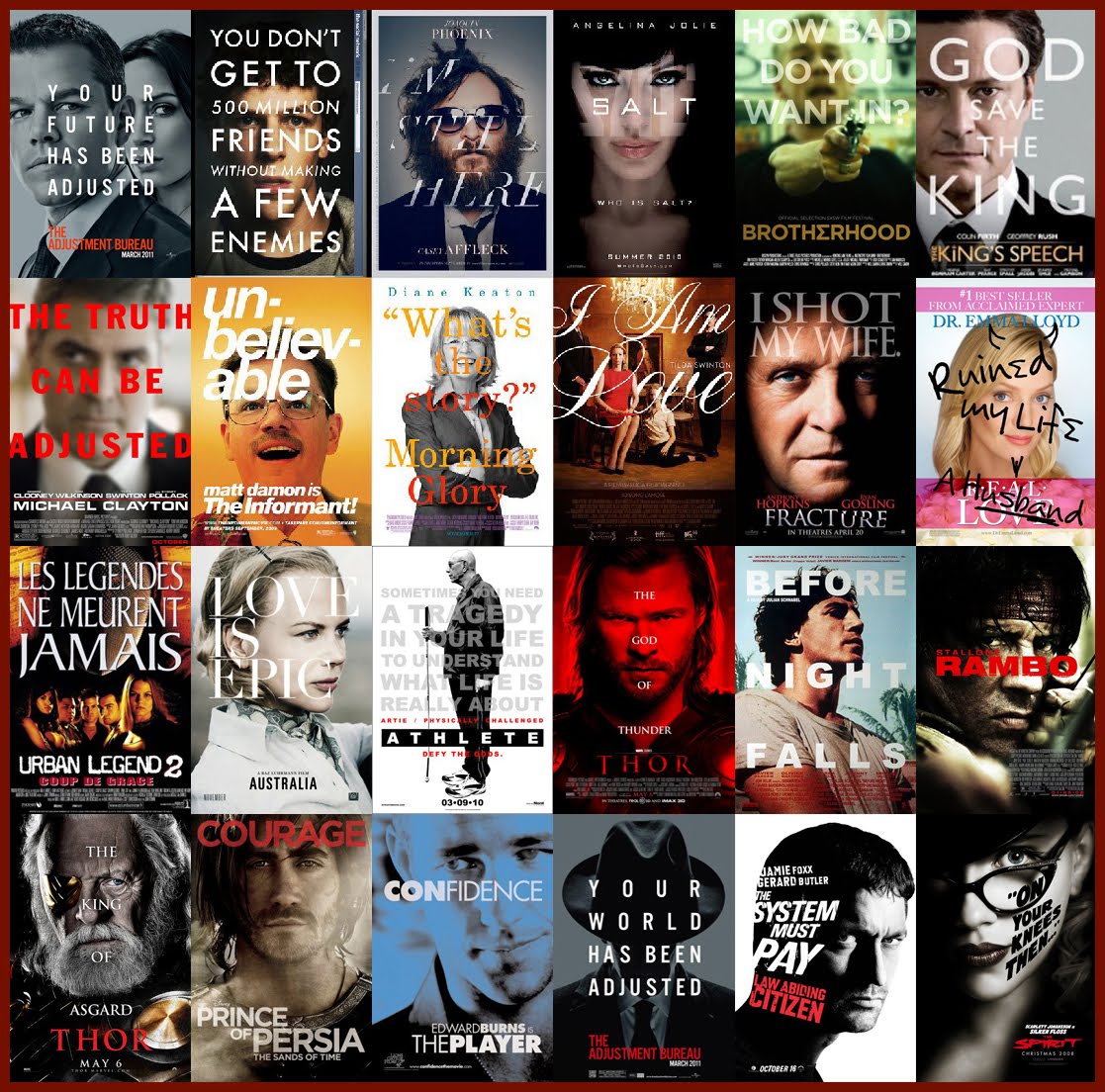
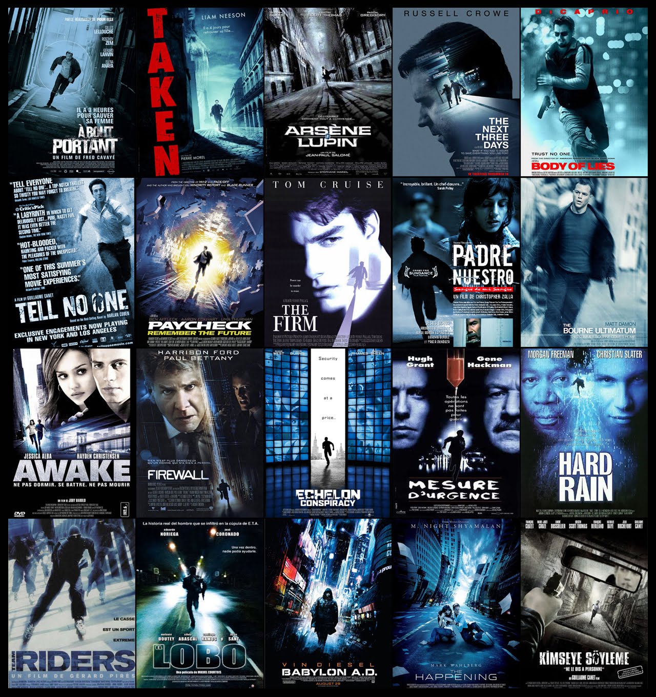
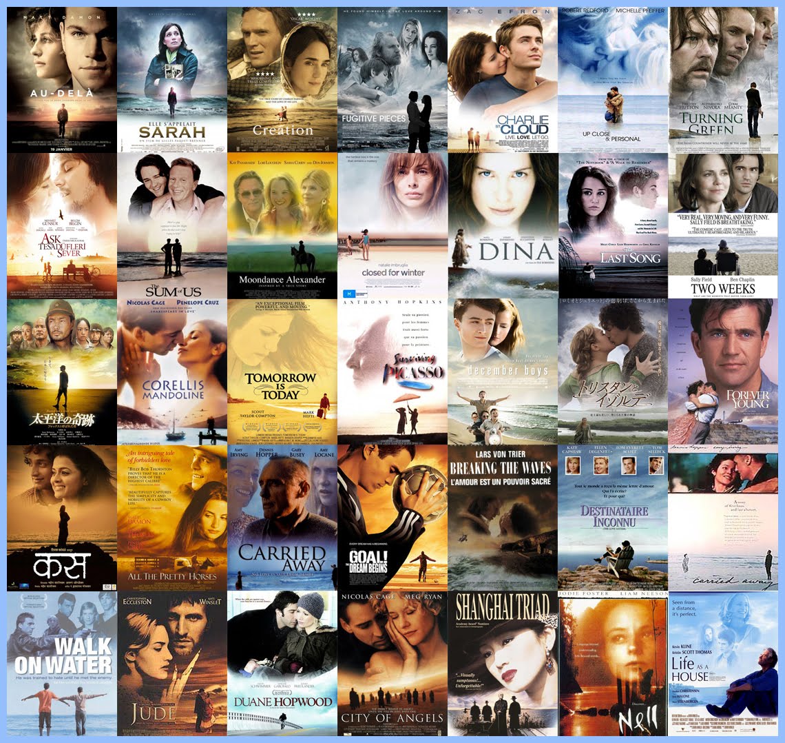
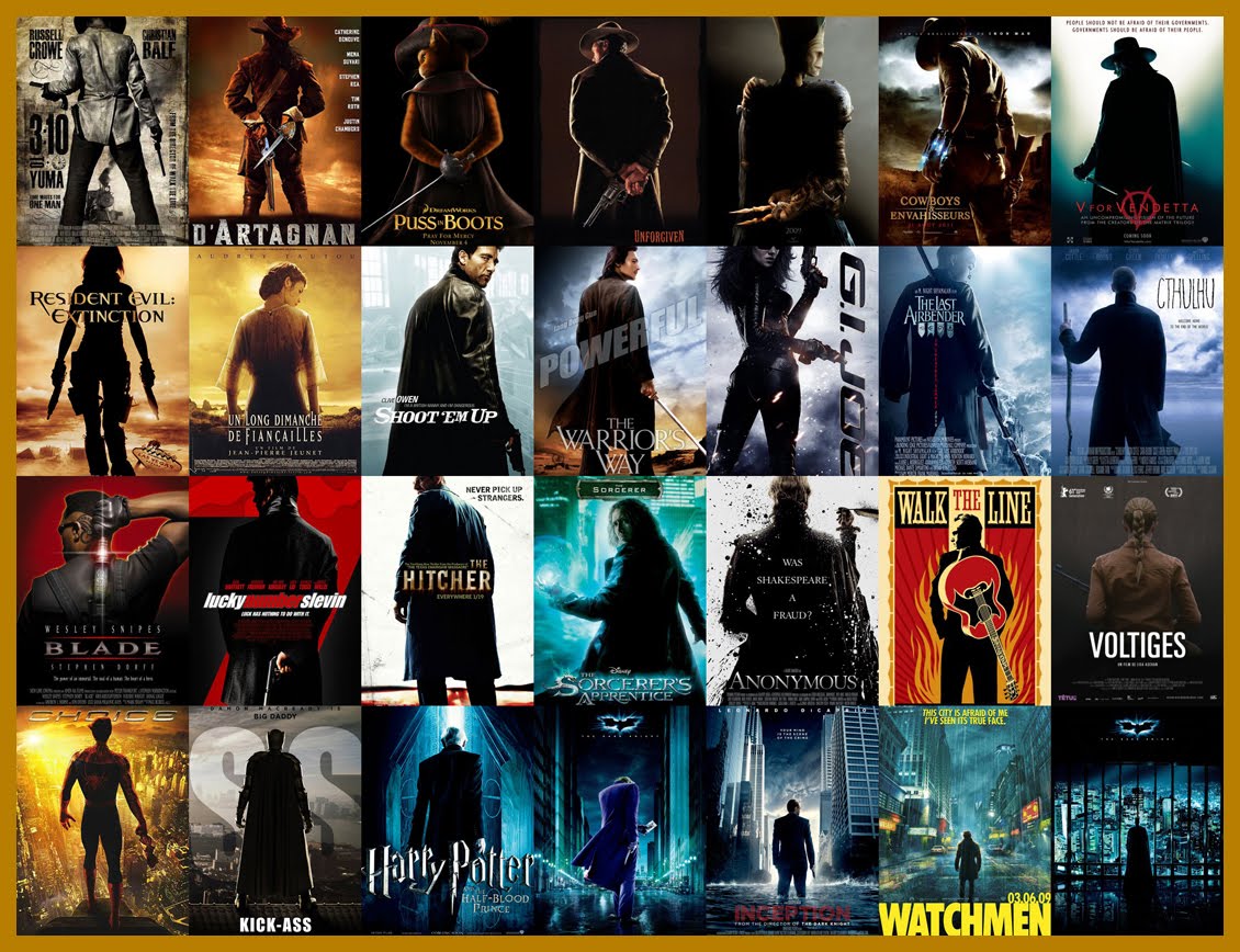
On his blog, Christophe Courtois compiles hundreds of movie and television promotional posters with striking similarities. Check them out below.
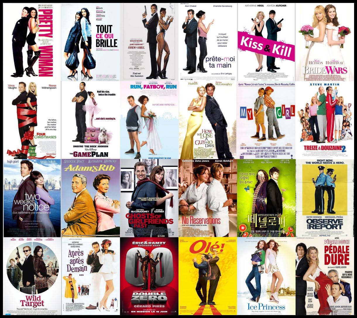
Romantic comedy duos standing back to back
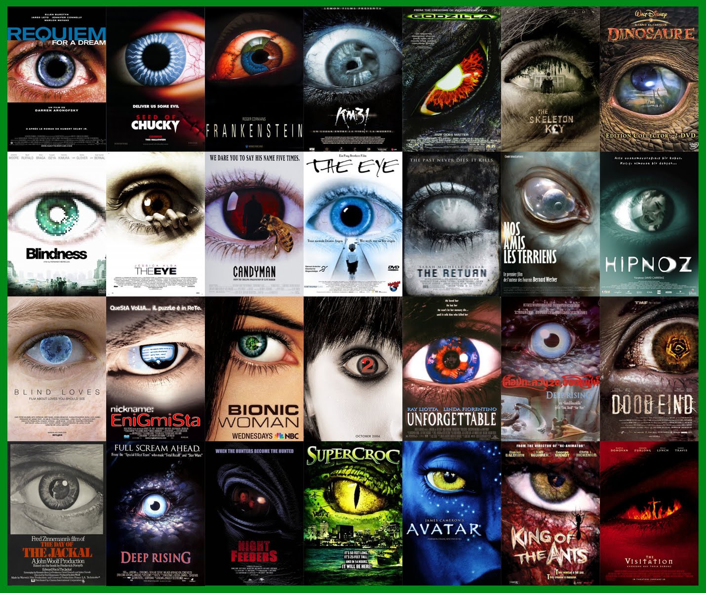
The evil eye
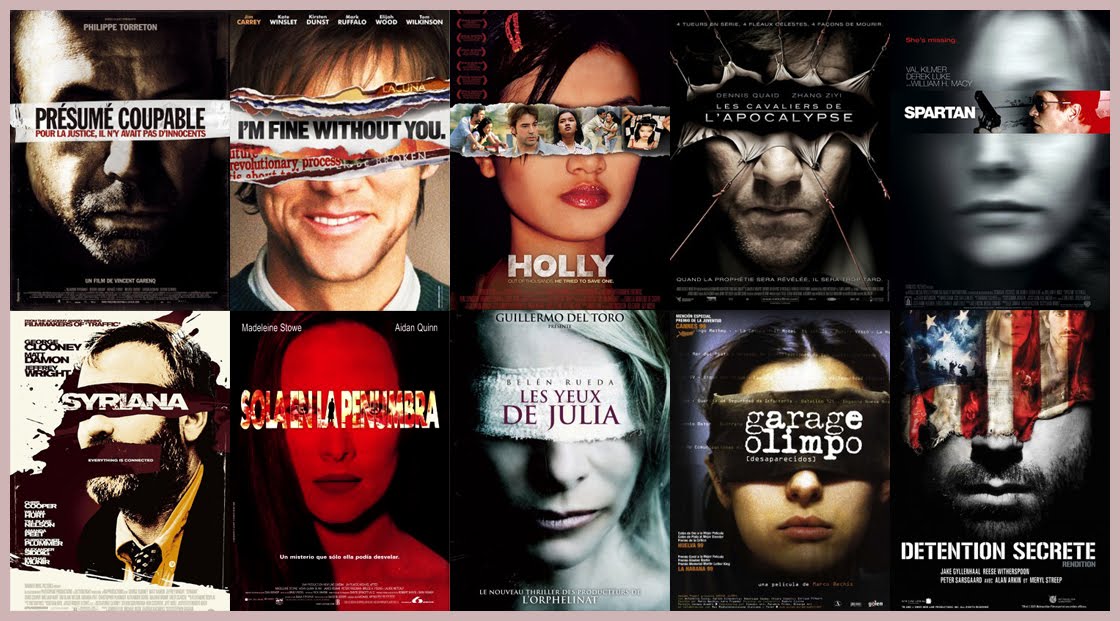
Or a blindfold
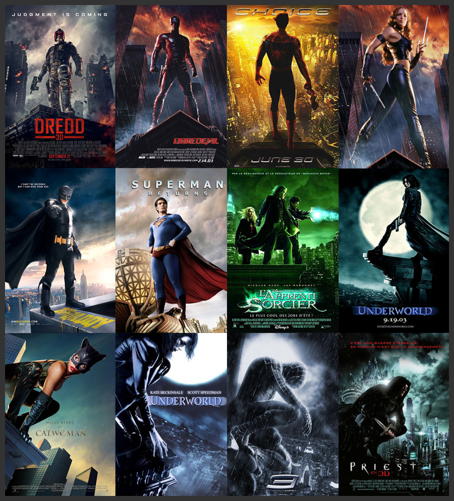
Comic book superheroes striking similar poses, often overlooking a city.
Can you read these faces?
People running for their lives, tilted at an angle and often on a blue poster
Giant floating heads
Main character looking over shoulder, usually with a weapon in hand
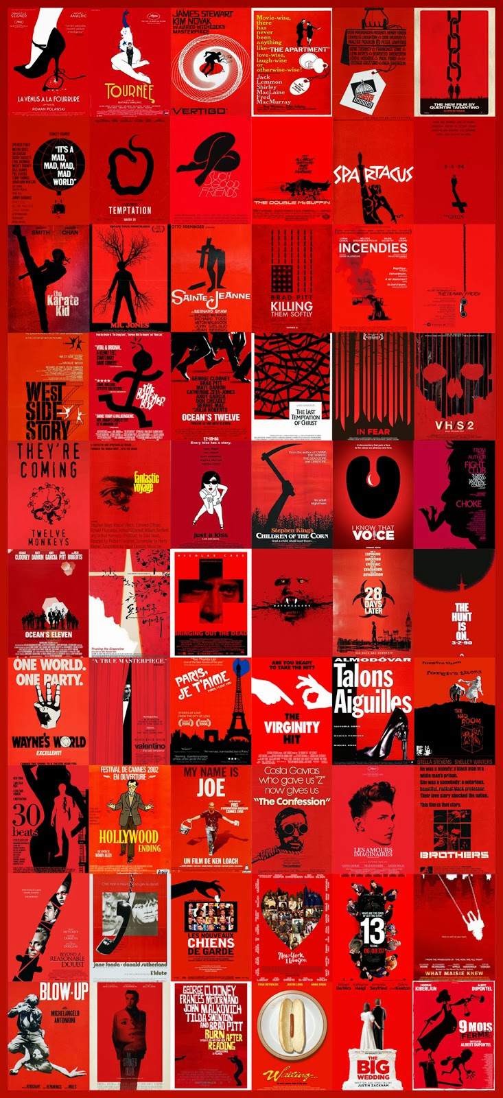
Rolling out the red carpet
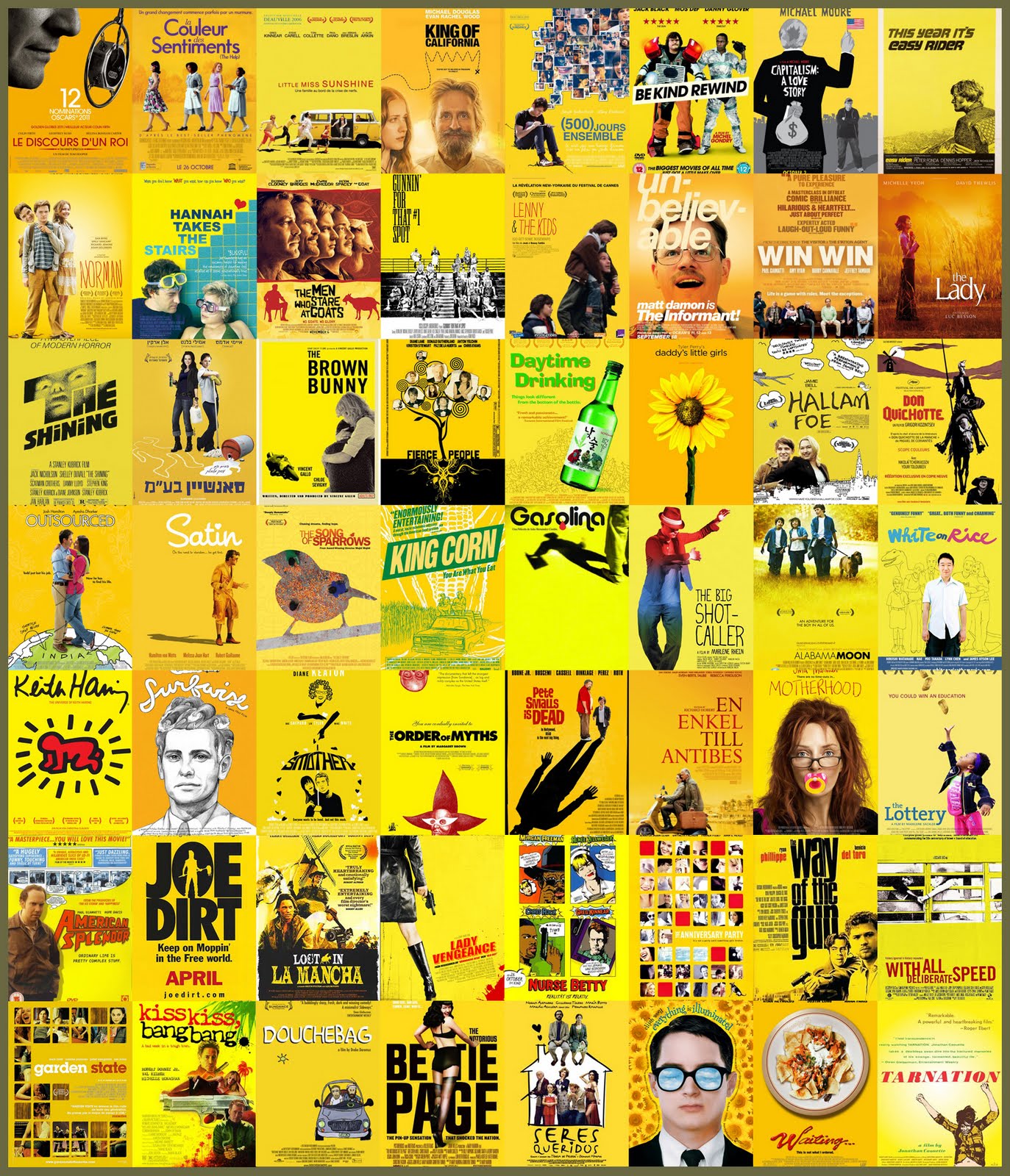
Or yellow
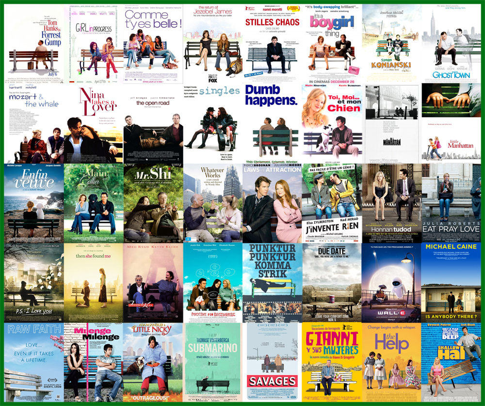
Sitting on benches
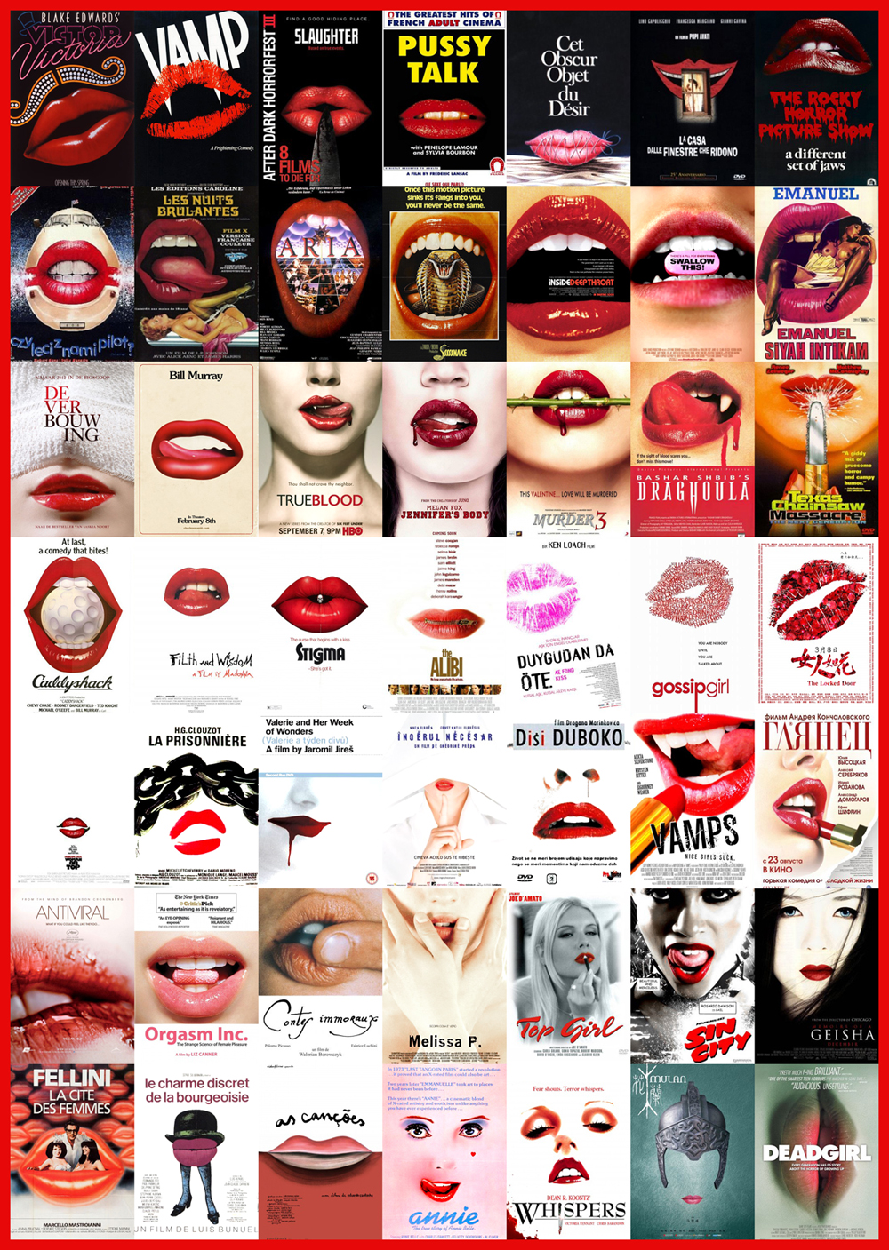
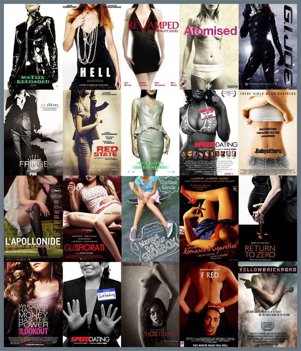
Luscious lips of a woman
Or her body
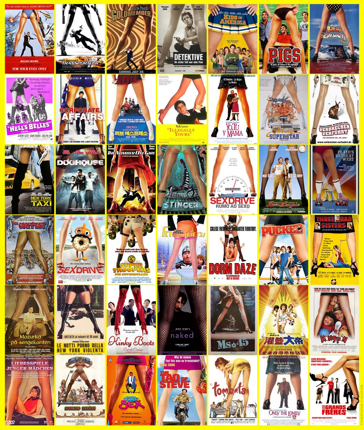
Between a woman’s legs
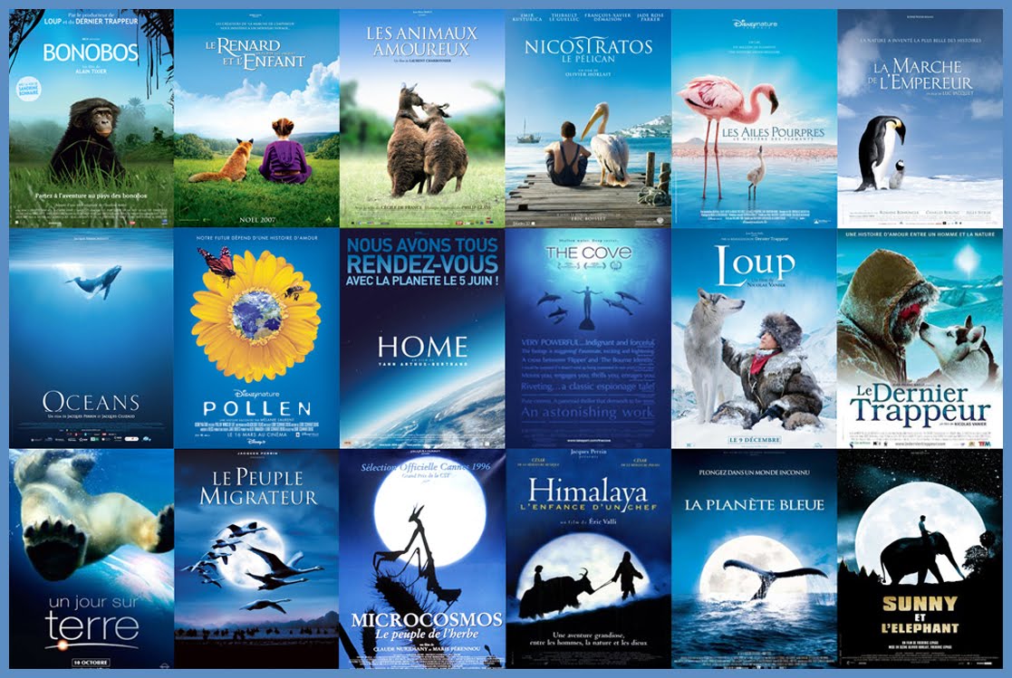
A natural focus against a mostly blue background
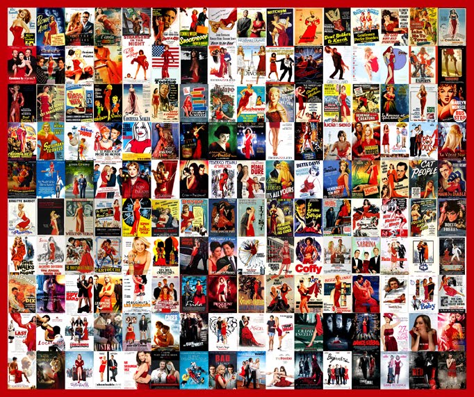
Lady in red
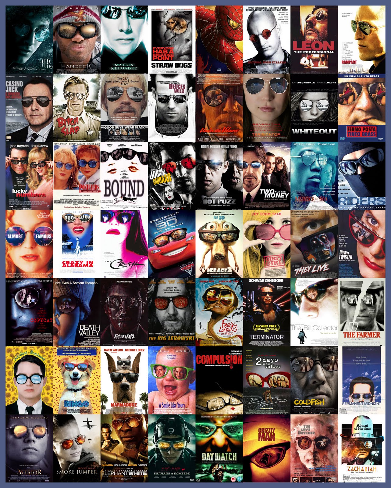
Glasses
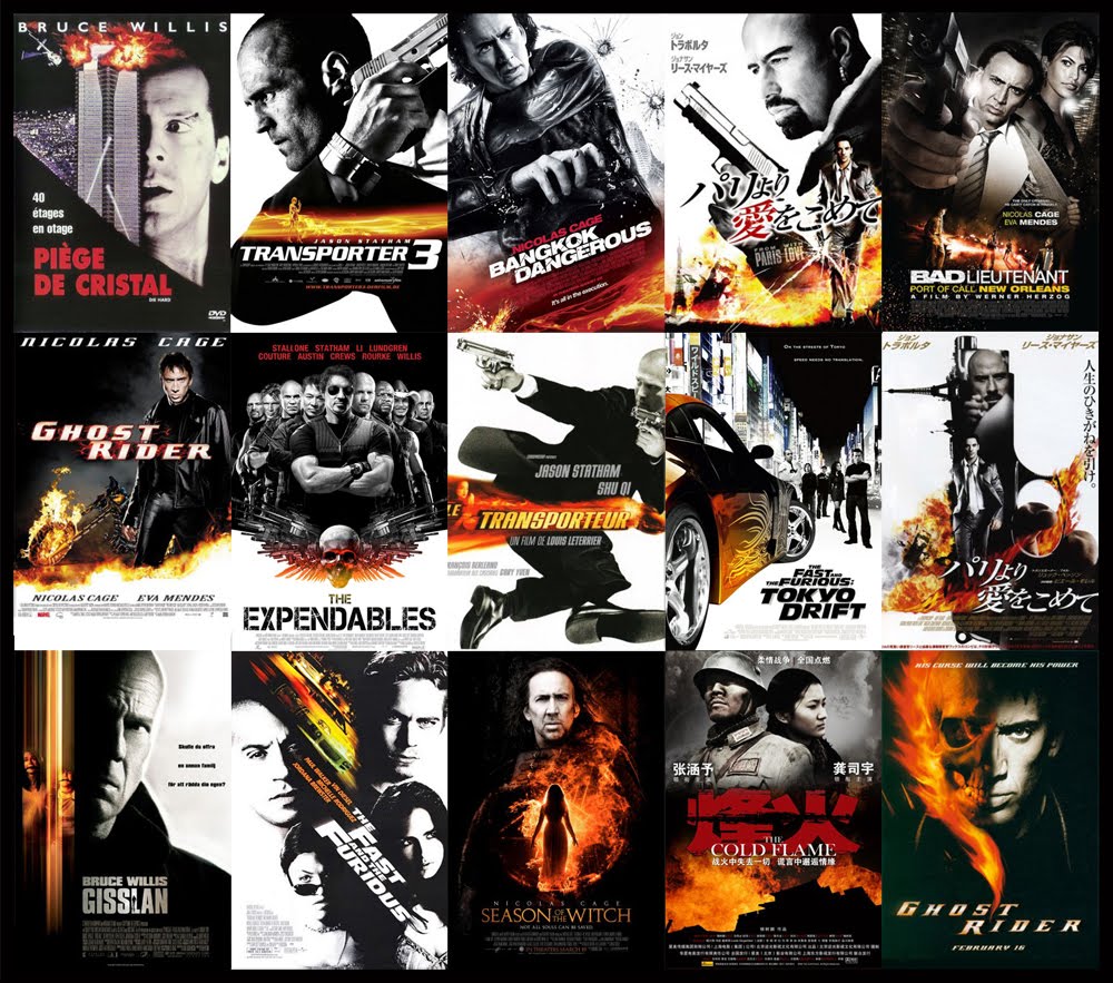
Black, white and orange
Studio execs, it’s time to refresh the design of your next movie poster. If not, someone might mistakenly buy a ticket for the wrong generic action movie! Share these similar movie posters with others below.
